Managing responsive background images with WordPress
This is a solution allowing for per-page responsive background images without setting hard-coded image paths in a stylesheet. This example assumes the image is set as the featured image for a page.
The two display issues we’ll solve here are both context-based: how to avoid serving an overly-heavy image to smaller screens, and how to adapt the image aspect-ratio to better accommodate the user’s current screen width.
The workhorse image
I regularly see images destined for the browser asked to perform an impossible task: dimension, format and aspect-ratio are each expected to be completely fluid while maintaining the integrity of the visual content.
A common device is an image with text overlaid—for example, imagine a banner at the top of a page. On a wider screen this will typically be heavily landscape-biased, but what happens when the available screen width is scaled down?
When viewed on a smaller screen the image will, by default, maintain its aspect ratio and be reduced to a short-&-wide strip. In conflict with this, text will flow downwards as line-lengths are considerably constrained by shrinking horizontal space.
This means the height of the image cannot be pre-determined; instead, it will always be determined by the dynamic height of the text block.
Background-size vs. object-fit
Choosing whether to use <img> with object-fit or a background image with background-size comes down to how the image needs to perform—browser support for object-fit aside—and layout requirements imposed by the design.
background-size and object-fit can be configured to instruct images to seep into all available space while preserving aspect-ratio. Both properties do this at the expense of controlling the visible width and/or height of an image. For more precision in how images are displayed, cropping becomes an ally.
The approach here works well where there's no SEO benefit lost by using a background image, and regardless of whether the image is displaying meaningful visual content or simply to provide "texture".
Defining alternate images
First, it’s necessary to tell WordPress to prepare new images for display. All images uploaded in the WordPress admin—via the Add Media button, Add Featured Image link, or directly in the Media section—can be easily targeted for resizing and cropping. In this example the image would be uploaded via the Add Featured Image link.
Let's assume two image sizes are required, large and small versions:
The first attribute is the unique name for the image; the second and third attributes are the width and height, respectively; the fourth attribute ensures the image is cropped exactly to the specified width and height (as opposed to resizing to one or the other dimension).
Source image
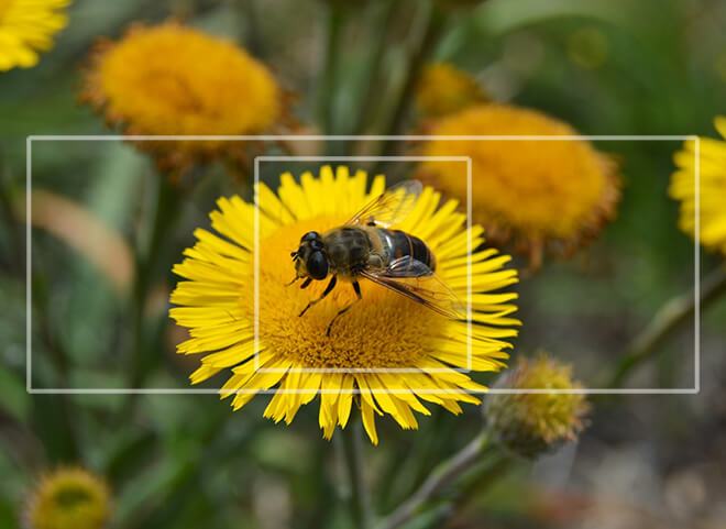
Using the image banner.jpg below as input, two new images will be automatically generated per the white rectangles.

WordPress-generated images are automatically named according to this convention: filename-[width]x[height].jpg. For example, the large version will be banner-1600x600.jpg, based on a source image called banner.jpg.
Retrieving the images
All we need to know to retrieve each image size is its URI, something wp_get_attachment_image_src() can provide. This example uses a featured image to store the target, so get_post_thumbnail_id() is used to retrieve the image ID.
The following function finds each variant of the target image and retrieves a URI. This is used to construct CSS media queries that will be inlined in the head of the page, using wp_add_inline_style(). An important caveat for using wp_add_inline_style() is the first argument must reference a stylesheet that is already loaded:
…and as it appears in <head>:
Using the images in a theme
The following markup uses the .banner class to set the background image:
… and achieves the following output:
Existing images
Existing images are not automatically resized when new image dimensions are specified via add_image_size(). WordPress needs to be instructed to regenerate this media.
If you're using WP-CLI, it's just a case of running 'wp media regenerate'. All new image size definitions will become available as a result. To generate from a single image you can add the image id to the end of that command: 'wp media regenerate 10' would only apply to the uploaded image with an ID of 10.
If WP-CLI isn't an option, there are a number of plugins devoted to this task.
Choosing breakpoints for images
Natural breakpoints for textual content will usually be suggested by the content itself: when the layout begins to look unintentional, a new breakpoint needs to be set. However, choosing image breakpoints can require a bit more thought. In this case it's wise to consider both the file size and whether the image remains visually meaningful (a bad crop or strange alignment will turn a 'content' image into a 'texture' image).